


The project itself :
Project Overview
While genealogical research is deeply rewarding, it can often feel slow, solitary, and complex. We designed the Year in Review 2025 animated experience to validate that effort—surfacing meaningful annual achievements through personalized, digestible data visualizations.
Problem:
Last year's Year in Review felt a bit flat and clinical, leaning too heavily on dry numbers and static tables. Therefore, we set out to make this edition genuinely exciting to explore and share. Top brands like Spotify set the bar with loud, high-energy graphics. We focused on striking a happy medium—with modern layout patterns and formats, while keeping each member's personal discoveries front and center.
Goal:
Building on the success of 2024 (+1k signups and half a million visits), our primary goals are to drive engagement and conversions, along with DNA kit sales and ProTools add-ons. We aim to make users feel recognized and valued by showing them personalized insights into their own behavior, inspiring further action.
My role:
UX designer owning the project and leading the a team of 2 designers on direction and execution.
Responsibilities:
YIR competitive analysis (past & present)
Graphic, prototyping and motion design
UX quarterly presentation on "What's New'
Led UX design and team collaboration
Usability testing
Initiate Accessibility reviews
All about the user :
Discovery
As design lead, I directed a visual designer and motion designer while driving the discovery phase. Because the other designers had limited capacity (a few hours per week), I took full ownership of the research: analyzing marketing objectives, running a heuristic evaluation of the previous year’s Year in Review, synthesizing competitive audits across industry benchmarks, and structuring our team's work streams.
UX Research Plan
Competitor benchmarking:
Audited top-tier industry milestone recaps to examine how products balance data storytelling with motion graphics. These insights helped our visual baseline, balancing dense metrics and light celebratory animation.
Stakeholder alignment:
Partnered closely with our Marketing team to understand campaign KPIs and research prior year’s experience. I ran a heuristic evaluation to identify friction points and find opportunities to amplify our message.
Design leadership:
Spearheaded weekly team meetings to share research takeaways, align on timelines, and guide next steps. Once I architected the core foundation, I delegated production tracks across our visual and motion designers.
Competitive Audit Review
Reviewed an internal analysis of other Year in Review milestones across 5 leading platforms—leveraging previous research from Product and Marketing to find design inspiration, uncover high-impact milestone metrics for our members, and map feature-gap opportunities into our engagement roadmap.


The project schematically :
Define
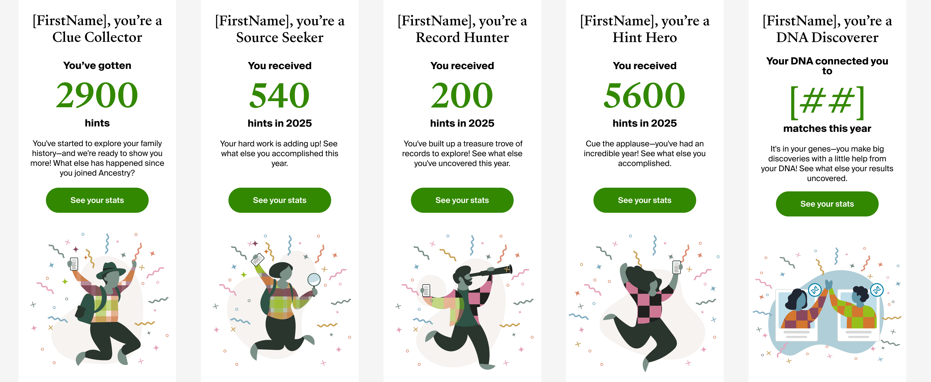
After my heuristic evaluations and strategic alignment with Marketing/Product, I created a UX framework across our design and cross-functional teams. The framework consisted of baseline user flows, curated content, and our new 2026 persona archetypes - to align our stakeholders around shared product and campaign goals.
Worked with marketing and content to define new persona archetype names, their stats and curated copy.
2 Core Userflows
Architected 2 core user flows tailored to distinct subscriber personas, differentiating experiences for Family History and DNA members. This is crucial for our cross-teams, especially engineers to understand how personalized 'Year in Review' content adapts dynamically across subscription tiers, clarifying edge cases and business logic for engineering and cross-functional teams
I created all the app pages mockups, incorporating the right design elements such as typography, color, and iconography. Also I developed all the necessary components and needed elements. The goal was to demonstrate the final Suplan app in as much detail as possible.

The clear version :
Design
Under a very aggressive delivery timeline, I spearheaded a rapid redesign of the Year in Review's theme and visual direction. I partnered with our visual designer to create custom micro-graphics that brought complex subscriber metrics to life, while independently prototyping motion designs to validate dynamic slide transitions. Once we established high-fidelity concepts, I worked with our UX researcher to conduct comparative feedback against the previous year's designs.
Mockups
I co-led the end-to-end design exploration phase alongside our visual designer—architecting a 105-screen responsive mid-fidelity framework across web and mobile. We organized the narrative into three distinct milestone pillars: Family History activity (records and hints), DNA community engagement (new matches), and aggregate annual discoveries.
These designs established early critique cycles across Engineering, Product, Content Strategy, and Marketing, enabling rapid iterations on narrative pacing, technical constraints, and thematic microcopy.
In addition, we wanted to conduct a comparative usability test against last year's static experience to benchmark sentiment.
Deliberately pushing beyond the conventional, conservative product aesthetic, we explored expressive art directions—experimenting with vibrant palettes, dynamic geometric shapes, and bold editorial typography to create an energetic, celebratory atmosphere


Customer Research
Partnered with a dedicated UX Researcher via Zoom to architect a lightweight, unmoderated testing plan.
The purpose of the test was to measure user sentiment and visual preference between 2 versions of design, testing the hypothesis that shifts from our conventional light UI to a bold, dark-themed canvas. Our goal was to heighten visual engagement without diminishing usability
Objective: Asses user reactions to the new Year in Review exploration screens (v2) comparing it to last year's version subdued screens (v1) to inform the final design direction. Users tested: 200 Ancestry subscribers and non-subscribers
86%
preferred the new design over last year's design. Some commented that it "felt fun and engaging.." Others mentioned they wanted to "see more data."
72%
wanted to hit the 'share' button. Most users were open to sharing their family tree and DNA progress. Some were hesitant on sharing any personal information online.
89%
expressed overall delight with the year in review. Despite not seeing real data, most users were anxious to see the upcoming YIR announcement in their inbox or account.
High-fidelity prototype
"I prototyped over 50 interactive concepts for the Year in Review experience—choreographing micro-interactions and motion design patterns across custom illustrated personas, dynamic graphic transitions, and animated metric counters celebrating core user milestones.
Developing these high-fidelity prototypes served a two-fold purpose: providing cross-functional partners with full visibility into interaction states, edge cases, and pacing ahead of the engineering build, while establishing a baseline for final asset handoff with our specialist motion designer.
I turned my mockups into a prototype that's ready for testing, using gestures and motion, which can help enrich the user experience and increase the usability of the app.

Ancestry Welcome slide
Hints and Record data slides (5)
Family Tree data slides (2)
DNA slides ( 3)
Upsell slide - "Gift DNA kit"
New Features slide
Summary Highlights
Persona Archetype
Thank you slide
The project schematically :
Outcome
The Year in Review launched to an overwhelming success across both Ancestry subscribers and internal leadership. The project’s impact was showcased at RootsTech 2026, where our CEO Howard Hochhauser spotlighted the experience during his keynote address—projecting his own personal Year in Review milestone data onto the arena jumbotron to demonstrate our product's personalized storytelling.
Takeways
The key difference for this year's launch was to shift to a scalable and reusable product architecture, which is an industry-standard approach for retention and loyalty.
The new data service implemented in the backend is now reusable for other milestones in the customer lifecycle.
Impact:
• Launched December 11, 2025 to 12.7 million users across all segments
52% clicked ‘Start working on your tree’ CTA on the last page to engage with the product
80% of users who viewed the Year in Review, made it to the last page
(+8% from 2024)1.4% of users, clicked the ‘Pro-Tools’ CTA to purchase the add-on feature
.5% of users clicked the DNA kit CTA to purchase a DNA kit
.2% of users clicked ‘invite others’ CTA (Strong area of optimization for 2026) **an idea that I pushed for in my design.
Sent to an estimated 12.7 million users across all primary segments
What I learned:
Looking back at this wonderful project, i learned quite a few things:
Leading the UX team for the year in review was no small task. It took a village to put this one together
We were given the creative license to break away from our everyday design system guidelines, allowing us to pioneer a fresh visual theme
A defining highlight was seeing Ancestry CEO Howard Hochhauser showcase his personal Year in Review on the main stage at RootsTech.
Overall - A deeply rewarding cross-functional effort that delivered measurable customer delight and marked a milestone achievement for our product and design teams
Next Steps
The series of hand-drawing frames that visually describe and explore a user's experience with a product.
Identify any additional areas of need and ideate on new features.
Identify any additional areas of need and ideate on new features.